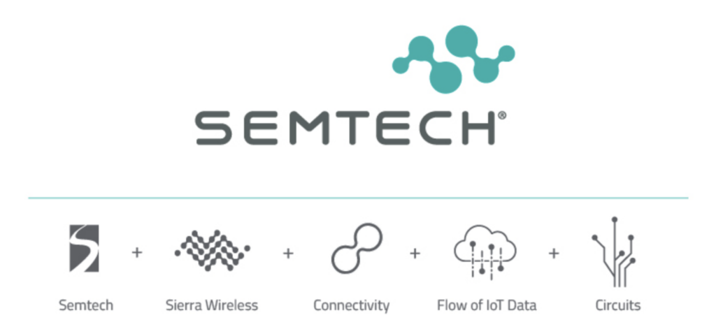
Semtech has rebranded to incorporate its acquisition of Sierra Wireless into its iconography and impose some visual logic on its expanded product portfolio – and also to position itself, as a home for both non-cellular and cellular IoT, as a proponent of planet-saving tech. The move reflects the importance of its stable of IoT interests, which includes long-time ownership of the LoRa technology and brand-new stewardship of cellular IoT outfit Sierra Wireless.
These wireless radio frequency (RF) business elements are only pieces in its broader offering; California-based Semtech was founded in 1960 as a maker of analogue and mixed-signal semiconductors for various consumer and enterprise computing markets. It bought LoRa, as the core technology for LoRa-based devices and LoRaWAN networks, from France-based IoT originator Cycleo for $5 million in cash in 2012.
The purchase of Canadian cellular IoT module maker and airtime provider Sierra Wireless, which closed in January, beefs-up its low-power wide-area (LPWA) portfolio, with a statement-making excursion into cellular-based connectivity, and a full-scale chip-to-cloud solution portfolio. The rebrand, which reduces-down the Sierra Wireless IoT motif in place of the old S-logo, makes clear the importance of the deal to Semtech, and also of IoT to the firm.
A statement said the acquisition provides Semtech with a “wide range of semiconductors, cellular modules and routers, software, and connected services to simplify and accelerate digital transformation”. It called the new brand-logo “modernized”, and a symbol of their combined “strengths in semiconductor, connectivity, and IoT”. It also spoke of a new “colour palette of eco-friendly shades” to articulate its focus on “sustainable technology solutions”.
Effectively, Semtech has (sensibly) simplified the old Sierra Wireless brand motif, and explained it away as a visual representation of connectivity, data, and circuitry (see graphic below). It has also softened the sharp-edged Semtech typeface with a capitalised tech-friendly font that also works with its serious-minded Industry 4.0 focus. Its eco-minded colourway looks like a straight mix of grass / planet green and sea / tech blue – at a guess.

Semtech made a point to emphasise its non-IoT business elements, which appear to sidelined somewhat in the brand refresh, but which are complementary with its expanded IoT push, it said. “Semtech’s protection business also helps to eliminate e-waste and its signal integrity business offers low power solutions for leading data centers,” it stated..
Julie McGee, chief marketing officer at Semtech, said: “I am very excited to unveil our new visual identity that captures the new Semtech. Our new identity embodies our vision, our values and the core promise of our brand to deliver innovation and industry leadership and to be a trusted and valued partner of the world’s innovators, working to develop solutions to enable a smarter, more connected and sustainable planet.”

